Archive for January, 2019

Latest trends in website design, and why …
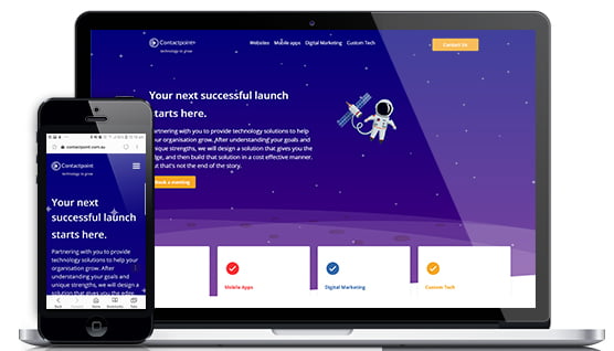
January 22nd, 2019 by Heather Maloney

We have just undertaken the huge task of re-designing and re-building the Contactpoint website. Until last week, our website design was over 5 years old, which is ancient in web timelines, particularly for a web design & development company. Our previous website design was aimed squarely at indicating that we were working with the Windows Metro Tiles in our mobile app designs and builds. The Metro Tiles design style was fairly new at the time, which confirms just how old our site design was!

When you have a large website, with lots of historical content created as a result of hundreds of hours of investment, and when your site covers many areas of endeavour and really matters to the way your organisation is viewed in the marketplace, then refreshing your website is a significant undertaking.

Do you have the impression that your website looks a little out of date, but aren’t sure why? Are you wondering whether it is worth the time and resources required to refresh your website? In this article I will address both of these questions, and of course, I’d be very happy to discuss this questions with you if you need a sounding board.

Current Design Trends

First, let’s have a look at the latest design trends that you will be seeing in the newest websites, and some reasons behind those trends.

1. Cartoon / Hand Drawn images:

Latest design trends - illustrations

It is currently very popular to use illustrations, rather than photos, particularly in software-as-a-service or start-up technology company websites. Illustrations are helpful to convey new ideas without the constraint of a photo, and explain a new concept in pictures rather than lots of words. Similarly, we are also seeing much more use of hand-drawn, unique icons to help direct the user to the right information, and to solidify a point being made. The quirky and hand-drawn style of illustrations and icons make websites more friendly and engaging. You can see this in the icons used on the Yelp website and Slack website for example.

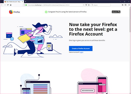
2. Lots of white/empty space providing separation of sections of content, also with less information per section. Both of these visual devices make it very easy for the visitor to take in the content, and focus on the key point/s. The new Firefox website shown above is also an example of this trend. This also makes mobile responsiveness easier, as you have less content to deal with on the mobile, however, it needs to be balanced against the impact on search engine optimisation; Google works out where your site should be ranked primarily on the content you include in your site, so you need to have significant amounts of content.

3. Animation of icons, logos and form fields. We won’t be going back to the days of flaming logos, however, with new programming libraries being created that facilitate easier, sophisticated animations using Javascript, animation is being more freely employed to:

  • provide visual cues to the visitor to suggest interaction points
  • gain the attention of the visitor to more important parts of the site
  • provide a delightful user experience

For a beautiful example of an animated logo, check out: Fubiz (you need to wait first for the whole site to download, and the logo animation doesn’t run constantly so you might need to be patient). The Myer website currently employs an animated logo to emphasise the “My” in Myer matching their TV advertising slogan. The Ikea website uses an animated icon to highlight information about their parcel delivery service.

4. Use of video. Like animation, video grabs the attention of the visitor, and provides for deeper engagement with your audience. The use of drones to create unique footage is also continuing to drive the popularity of video, as seen in the home page element of the new Brighter Lines website.

Video is increasing being used in more subtle applications – backgrounds that automatically play in order to add atmosphere to your website without requiring the user to focus on and listen to audio at the same time.

5. Design for mobile. This is not so much a new trend, but designing for a great experience on mobile devices has become even more important with Google’s recent change to “mobile first” for ranking of websites, whether you are searching via your mobile or not. Not only does your website need to look great on very small screens (and every other size) it must also be very fast to load on mobile.

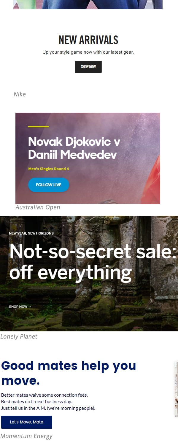
6. Headings, Headlines and Buttons. Examples of the latest trends in headings, headlines and buttons are shown below. These trends are partly about fashion, but also strive to make text shorter, and calls to action, very clear and obvious. They are used to take the visitor down the desired path.

7. Typography. Choice of fonts has become more important with Google making it easier to incorporate a unique font into your website, without sacrificing load speed or readability. The font used in your website will be focused on ease of reading on screen which is why sans serif fonts dominate. Large fonts, and capitalised headings, are used widely, as shown in the examples above. The space between lines and paragraphs are carefully chosen for readability and aesthetics.

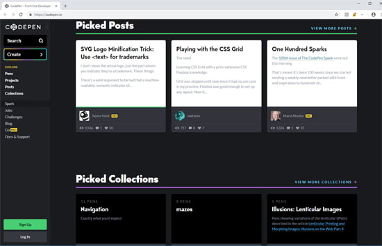
8. Cards, tiles and panels. Google’s Material Design was launched in 2014, incorporating flat design – predominantly solid, strong colours – bringing to digital design the concept of surfaces with edges that guide the user, but can extend based on interaction due to the digital nature of the surfaces. “Cards” and tiles with subtle drop shadows, becoming more pronounced on hover, help to focus the visitor’s attention as well as provide subtle interactivity with your website. Google also provide programming language around the elements of their design system to assist in their implementation. Cards and panels are usually implemented in a grid system, which aids mobile responsiveness. An example of cards implemented by CodePen.io is shown below.

Reddit and other news style sites use this design element extensively.

9. Asymmetrical Designs As a break away from the extensive use of grids and boxes, asymmetrical designs are becoming more frequent. The Cloco website is a great example of asymmetry. Our new Contactpoint home page – custom technology Melbourne with angled background sections are an example, leading the visitor’s eye to want to keep scrolling down to see what comes next.

10. Hardware driving design trends. For mobile app design, the iPhone X requires special treatment due to the “notch” cut out of the top of the display and the introduction of “Super Retina” display. The digital screens now surrounding stadiums such as the MCG and inside the Rod Laver Arena, also drive design changes as they extend the boundaries of what is possible, and increase expectations of viewers.

The above is not an exhaustive list of all the design trends you will be seeing on the web, but it will certainly help you to pinpoint why your site might be looking a little old compared to newer sites.

Why is it important to keep up with design trends?

If you are not in the fashion industry you might question why you need to try and keep up. Certainly, we are not planning to change our website design every time something new hits the web. However, the design of your website, and all your marketing material on and offline, is a powerful indicator of who you are, and who you serve.

The following are important reasons why you might consider a design refresh:

  1. Fashion. There are those who make up the numbers of the “standard deviation” (the outliers who like to start new trends, or go off grain) and then there is the majority; people behave in a tribal way, following the trends of the tribe or group of people with whom they want to identify. The concept of Tribal Marketing asserts that when the trends and look of the tribe that your organisation serves moves, you need to move with them so that you are still recognised as being part of the group and serving that group.
  2. Keeping up. The desire to keep up with the latest and greatest, or not miss out, is a strong drive. Looking outdated can be a signal that your products and services are also not up to date. Depending on your industry, falling behind can mean losing competitive advantage or missing out of value available to others.
  3. First Impression. Research has shown that website visitors make a judgement call about who you are in a fraction of a second. Having a good first impression via a strong website design is important to keep a prospect on your site long enough to find out more about your offer.
  4. Improvements in experience. Most of the design trends described above are not just about changing for the sake of fashion; the changes are part of constant improvement to help guide the people you serve, and want to serve, to action, and communicate your most important messages more clearly.
  5. Communication. Getting your message across – all of your message – can be delivered so much more effectively through design and visual elements, compared to all the words it would take to deliver the same message. The other side of this coin is that your design might be communicating messages to your visitor that you aren’t intending, especially if it has been the same for a long time.

We understand all the steps involved in designing a new look site that appropriately reflects your organisation and positions you correctly for your target audience, and then building your new site to achieve the greatest engagement of your visitors. Don’t hesitate to get in touch to discuss your website or web application design.

Facebooktwitterredditpinterestlinkedinmailby feather

The Latest Email Campaign Design trends

January 18th, 2019 by Heather Maloney

Design trends are a favourite topic for discussion at the start of each year. However, what is possible in the design of an email campaign is significantly constrained by email programs used by the recipient (or at least, the lowest common denominator of email clients). Email design must also ensure a great experience for those reading on a mobile phone, as well as a desktop computer; as of June 2018, 46% of all emails are opened on a mobile phone(1).

Emails from major brands continue to be highly designed, and consist predominantly of all images. It seems that the major brands expect that their customers will open and download the images so that they can actually see the email, without any further encouragement. Less popular brands and professional organisations, however, would be well advised to intermingle images with text and colour blocks that appear without image download, to entice the recipient to read with more than just the sender’s name and subject line.

One of the most popular design trends in emails is including animated gifs to entice curiosity and therefore click through to the organisation’s website. Animated gifs can also be used to better explain concepts inside an email; a picture tells a thousand words. Because you want the animation to surprise and delight, using them in every email you send runs the risk of becoming predictable, so mix it up.

It is also important to note some difficulties with animated gifs inside emails:

  • Unfortunately Outlook 2007, 2010 and 2013 do not support animated gifs, and will show the static version of the animation by presenting the first frame of the animation. That means you need to include all the important information in the first frame, to cater for the high percentage of users still using these versions of Outlook (approximately 8% of the global population).
  • Many frames and complex animations will cause your images to get very large, very quickly. So you should stick to very simple animations.
  • It takes more design skills to create great looking animated gifs, compared to a single static image.
  • Accessibility for the visually impaired can also be an issue. Consider slowing down rapid frame rates, depending on the image.


(image courtesy of Review Australia email)

Including live content in the body of your email – think live results from a poll, count down to the end of a sale or ticket availability, latest content shared by other customers, current weather, something happening close to the location of the opener. Live content is information that is updated when the recipient opens your email. This tactic, if used to provide richer, more relevant experiences for your reader (not just used as a gimmick) will significantly increase the engagement of your audience and possibly aid in community building, and will cause an increase in the number of times that an individual opens the same email. Live content is being seen increasingly in social platforms e.g. Facebook Live where users are streaming video from an event. Live content is also a tactic that you will want to make careful use of, as it can backfire if the live content rarely changes, is of poor quality, or is uninteresting.

The use of live content is likely part of a cross-channel marketing campaign. For example, a physical event, involving sharing of content online, with online ads pointing to the website, and an email campaign promoting the event before, during or after. This trend of co-ordinated marketing across multiple channels has been a goal for marketers over many years, but made difficult by disparate systems. As technology integrations proliferate some of these difficulties are being removed, and the end consumer is seeing the same message in more places, with great effect. Delivering a co-ordinated marketing campaign across multiple platforms – ads, website, emails, offline marketing – requires a lot more design effort and co-ordination across multiple teams in larger organisations, but will produce significantly better results than a message only distributed in one channel.

If you would like help to use any of the above trends in your email marketing, don’t hesitate to get in touch.

(1) https://litmus.com/blog/email-client-market-share-trends-first-half-of-2018

Facebooktwitterredditpinterestlinkedinmailby feather

The Swiss Army Knife of Digital Marketing – Google Display Ads

January 5th, 2019 by Cameron Collins

You may have noticed that Google has recently changed the name of their advertising platform from Google AdWords to Google Ads. Name changes can be risky, but in this case we think it makes perfect sense.

Google first offered text ads at the top of their search result pages in October 2000. These ads are still popular today. For our clients, they offer those in competitive industries to opportunity to achieve exposure and traffic in relevant but hotly contested searches.

While visibility in relevant search results is highly valuable, gained by search engine optimisation, this often won’t guarantee a sufficient level of online leads or sales generated from your website. For example what if:

  • There are very few relevant Google searches for your product or service.
  • You wish to encourage your website visitors to return to your site (especially if you have a lengthy sales process).
  • You have a new and unique offering and wish to gain brand awareness.
  • Your product is visually stunning – you know your target audience will be interested if only they could see it.

Google gradually expanded their ad network offerings, with search ads being joined by display, shopping, video and universal app ads.

What are Google Display Ads?

Display ads appear throughout approximately 2 million websites and apps which are part of the Google Display Network. News websites with ads in the right side column are an example of this. Other options include ads underneath YouTube videos and at the bottom of the screen in apps.

Display ads have taken off in recent years, and for good reason. These can be used to reach your target audience at all stages of the sales funnel.

They’re highly cost effective, with the average cost-per-click at $0.63 (compared to $2.69 for search ads).

What really makes these ads stand out from other advertising channels is the unique audience targeting options which are available. You have the ability to request that Google displays these ads to:

  • Previous visitors of a particular page or pages of your website (these are the ads that “follow you” across the internet).
  • People who have recently conducted a Google search for search terms which are relevant to your product/service.
  • People who have recently visited websites similar to yours (i.e. your competitors).

This makes Display ads highly versatile. They can be used to encourage visitors back to your website, particularly when they have demonstrated a level of interest, even added a product to cart but not completed the transaction. Products which are more complex or have a higher price tag are often not purchased spontaneously and involve a longer decision making process. These ads ensure your brand isn’t forgotten about during the decision making process.

Display ads also attract visitors who are interested in your product/services but have been visiting your competitors and not your website. Again for purchases which are not made spontaneously (e.g. a new car), or product/services which are not purchased as a once off (e.g. a chiropractor appointment), this is a great way to reach your audience, alongside organic and paid search results.

If you have a new brand or product that is visually stunning, display ads provide a great way to increase brand awareness at a low price, and draw visitors to your website, when they would otherwise be searching for more established brands (e.g. a stylish new brand of watch).

Misconceptions about Display Ads

A common misconception regarding display ads is that ad blockers will eventually render this format to be useless. As of 2018, the display network has been able to reach approximately 90% of global internet users. While Google makes their money from advertising, they understand that harassing internet users with obnoxious ads doesn’t benefit anyone. Google have begun to enforce standards from the Coalition for Better Ads. These standards aim to eradicate ad formats which annoy internet users the most – such as pop up ads which block the main page content, auto-playing ads with sound, countdown ads which delay the loading of main content.

Display Ad Case Study: Select Kitchens

We were recently approached to review the effectiveness of a Google display ad campaign for Select Kitchens. Select Kitchens offer prestige, high end kitchen renovations in inner-east Melbourne localities such as Toorak and Camberwell. Their display ad campaign was failing to attract leads for their sales team. At closer inspection, we found that the ads were not being clicked on. After being displayed 61,258 times (impressions) their ads had only been clicked on once.

And as you can see in the cost column, that one-click costed $17.33! These ads operate in a pay-per-click format, where you pay Google each time someone clicks on your ads. Without regular PPC management, you may find that Google makes more money from these ads than you do.

After reviewing the display ads in use, we found that they failed to describe the high-end products which their target audience seek. The ads appeared dated, cheap and more representative of a low-cost renovator.

In December we paused the existing ads and implemented a new style of ad. To gauge the effectiveness of the new ad design without the influence of other factors, we didn’t change the campaign targeting and displayed the ad to the same audience. The only other change we made was to reduce the allowed maximum cost-per-click from a staggering $40 to a more reasonable $3.00.

The new ad comprises a slow-scrolling animation of a modern kitchen, displaying simple key messages and ending in a call-to-action. It’s simple, elegant and stands out to those who have been searching for high-end modern and contemporary kitchen renovation companies.

The ad looks like a video, but really it’s an image that is being slowly displayed from left to right. Its design tactics like this make ads stand out without resorting to obnoxious and tasteless behaviour.

As you can see, the new ad has resonated with the target audience. It received 188 clicks at an average cost of $2.02 per click. Select Kitchens received their first-ever conversion from display ads, and with some adjusting to the audience targeting, we look forward to seeing many more quality leads.

If you would like to find out how Google Display ads can help your business, send us a message and we would love to have a friendly chat with you. Contactpoint has 14 years experience in providing lead generation and e-commerce solutions for Melbourne businesses through a range of digital marketing channels.

Facebooktwitterredditpinterestlinkedinmailby feather

Subscribe to our monthly

Contactpoint Email News

Our enews is sent out approximately monthly, and contains information on latest digital technologies, and how these can be used to help your organisation grow.

To subscribe, simply fill in your details below: