
The Art of Navigation
October 24th, 2023 by Heather MaloneyWeb and Application Navigation System design; arguably the most important element of websites and apps
The navigation component of digital assets such as websites, web applications, mobile apps, kiosk applications, is more art than science. Navigation is arguably the most important part of a website or application, because it is through the navigation that the visitor / user can access the wealth of information and functionality contained within.
The one navigation component can be accessed in different ways, depending on device being used; a finger or stylus may be used on a mobile device, but hovering over an item within in the navigation is not possible. At the same time, the ability to press and hold is available on such devices, along with multi-finger / directional gestures and deep press (on some devices). Desktop computers afford the user with hovering over elements, right clicking, double clicks and more.
There are many ways to structure navigation. Grouping related elements together is an obvious structure, but which elements should be first? Should the order be determined by importance, frequency of use, alphabetical order, logical sequence? And how is “related” determined can be subjective – related by topic, or by type of user who needs it, or by application, or all three? Will the navigation be spread across the screen with “top level” items always visible, or will all of the navigation be closed up into a “file drawer” (aka hamburger) icon until accessed?
Mobile applications present special considerations for navigational structure, due to the restricted screen size, which has led to the use of modal screens (where a page element that displays in front of and deactivates all other page content) in which all navigation is removed so that the user can focus on the task at hand, with the full screen real estate available for that task. The image below shows an example of an app we recently designed, which employs tab navigation (see bottom of the first screen) for the top level of the mobile app, but opens key screens with complex functionality, into a modal screen. The modal screen has a sub-navigation element to help the user access all the functionality of the screen.
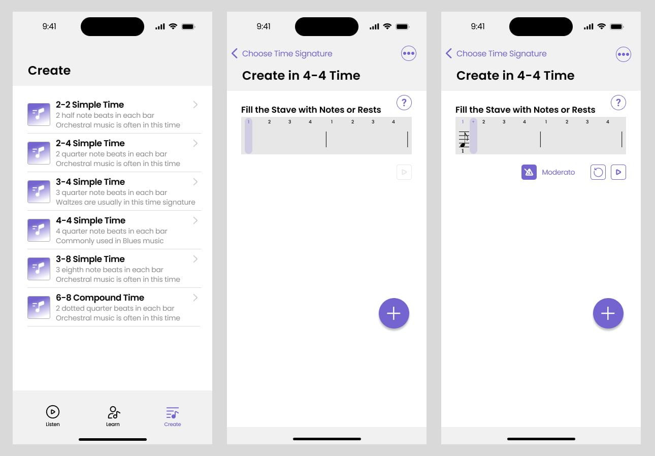
The use of the plus button, demonstrated in the app design above, is another relatively new navigation device. The plus button usually gives the user a set of options for adding items relevant to the web or mobile app that they are using. Xero added a plus button recently, making it quick for you to add an invoice, bill, receipt, etc. without needing to navigate to the related screen.
Whilst I mentioned that the one navigation is accessed by different via devices and selection mechanisms, in reality navigation is often subdivided into multiple menus. There is often a ‘main’ navigation, a ‘footer’ navigation, and potentially multiple sub-navigations within certain sections or pages of a website or application. When it comes to coding the navigation menus, the developer may end up building two or more versions of navigation, and controlling which appears on which type of device, by detecting the device type through the code. But from the perspective of the architect of the navigation, it is best to think of it as one system that needs to serve multiple purposes.
There are many ways to design the appearance of navigation. Including static headings or even descriptions within complex menus can help to add context. Mega menus are a fairly recent trend, which provide columns of options, helping the user to understand a broader scope of options under one main heading (see below for an example of a mega menu – click on the image to go to the website an experience it live!). Underlining, shading, active appearance vs hovered and closed, are all considerations along with applying your brand to the navigation design.

There are many ways to design the way the navigation behaves when the user interacts with it. Sliding open, down or across, flipping elements to reveal information, pushing elements down or covering elements, closing an already opened area of navigation when a new one is opened, or leaving all open. More complex animations can be used to deliver a playful user interface to delight users. This is more likely incorporated into very artistic or gamified applications.
Menus might float down the screen, or ‘stick’ to the top of the screen so that they are ever present.
Options, options, options!
Each option in structuring, visual designing and interactions with a navigation are not right or wrong. However, they certainly have an impact on the overall user experience and ease with which the user can find what they are looking for; which of course is the whole point of navigation!
How to design navigation?
1. List of all items.
When designing navigation for a client website, web application, SaaS product or mobile app, we always start with a review of the options needed to be contained within the navigation. Sounds obvious, right?
It is very common for what is seemingly a very simple task of listing what should be included in navigation, to turn into a long debate over what should be in or out. Equally common is that we understand that the list has been finalised, only for another very important item, which changes everything, to be “discovered” or remembered well into the design of the navigation, throwing the cat among the pigeons.
Regardless of these problems, step 1 is to start with a list of all the items that must be included in the navigation.
2. Agree on Prioritisation Method.
Step 2 is to agree on the method for prioritising the items. Where there is one cohort / type of user, then the method is usually fairly obvious. On the other hand, when there are 2 or more types of users, potentially with overlapping requirements, or where there is a very large number of things to be included in the navigation, and different views of the same information or tasks, then agreeing on the prioritisation method can be more difficult.
3. Prioritise, Group & Sort.
Once the method is agreed upon, step 3 involves actually prioritising, grouping and sorting all the items into a logical place within the navigation.
4. Creative Design.
Often during step 2 and 3, the discussion will start drifting into step 4 – designing user the interface and user experience of the navigation (aka look and feel). It’s best to leave step 4 until last, and keep an open mind regarding the design treatment of the navigation, after making certain that the design team fully appreciates:
- the decisions that have been made in step 1 through 3,
- what the user will actually be delivered when they choose a particular option in the navigation. For example, one navigation element might take the user to a web page, whereas another might open a popup form, and
- which device types and screen sizes are going to be used by the end user.
Many of the options for the UI/UX design of the navigation were described at the start of this article.
5. Build & Test.
After the navigation is designed, it must then be built by programmers or your web master. Of course there are many different options for the way a navigation system can be programmed. Simpler websites will use menu building tools provided by the web builder e.g. WordPress and WordPress Page Builders comprise functionality for building menus by dragging and dropping, and customising attributes without needing to write code. More complex applications will often use Javascript to implement the animations within a navigation system. Pure CSS navigation is also possible, and likely more lightweight, but certainly CSS will be used to help achieve the look of the navigation elements.
The implementation step will often overlap with the creative design step, particularly where the navigation is for a website which is using a visual menu builder.
The way a navigation system is built may have a big impact on the performance of a website. Google brings heavy influence over the implementation of websites, and the assessment of performance, through tools such as the page load speed test, and Google’s ‘Core Web Vitals’. If you don’t follow Google’s recommendations, you risk your website being penalised in the ranking of your website in the search engine results.
As with all things that are used by the general public, you can’t always predict how people will attempt to use the navigation, or how they will interpret what they are seeing. That’s one reason why testing is so important. The other, is that technology may behave well in the developer’s technical environment, but putting your menu ‘out into the wild’ of a wide range of devices, browsers, screen sizes, etc. can produce very different results.
How do you know your navigation is well designed?
You know when the team has done a great job of designing and building the navigation, when you never hear about it… it becomes practically invisible to the user because it is so intuitive, and everyone finds that they need without struggling or needing to ask for help. Even better is when the end user is delighted by the navigation!
Of course, there are more ways that a visitor can be guided through the pages and functionality of your website or application e.g. via text and image links. Search features are another common way to help users find what they need. However, navigation components remain the main way that people find information and functions.
If you are fielding lots of calls / emails from customers who can’t find what they need in your application or website, or you are struggling to work out where to put your new page or function, it might be time to revisit the navigation system. Contactpoint is very happy to help you to design a new navigation system, so don’t hesitate to get in touch.
 by
by 


