Archive for April, 2022

9 Reasons to Use Website Animation in your Web Application or Website (and when not to)

April 26th, 2022 by Jimmy Bui

Website Animation

“Website animation” refers to movement of content onscreen, but is distinguished from video / movie content.

There are many useful applications for animation in your website or web application.  Some of the most common animations you will see in modern websites and web applications include:

ACTIVITY INDICATORS

Waiting for a screen to refresh after submitting information is bad enough, but when there is no indicator that something is happening, people get nervous!  The spinning icon that appears in the middle of the screen gives you just enough visual indicator that something is happening, to remove the temptation to click again, just to make sure something is happening.  🙂
Loading animation

Whilst tempting to fill the page with them, that’s the last animation we will actually embed in this post!

Interactive forms

When you click in a form field, and a set of instructions slides into view to help you fill out that field.  Showing (and then rapidly hiding) each keystroke as you enter your password uses animation to help you get your password right, without letting others easily see it.

There are many ways that animation of form elements is used to guide a person to complete a form, including on-the-fly error handling.

Photo SlideShows

Communicating key messages to your audience in the one area of the screen is often achieved via an image & message “slide show” at the top of a website home page.  The home page slider uses movement and visuals in a defined area of the screen to quickly convey information, and attract attention, without the visitor needing to scroll.

Animated Graphics

For example, a logo that draws the attention of the viewer as it “forms” in front of your eyes will help your audience remember your name and branding.  We have assisted clients recently with animated logos as intros / outros for webinar presentations.

Animated graphics are also used to delight the viewer, or make a big impact, for example the animation at the top of the Enudge website.

Animation is often used to help communicate concepts, and is widely found in online learning to emulate a physical educator, and/or visually teach the viewer.  The quiz / card game “Know Lupus” is a great example of the use of animation to educate.

Simulation can be greatly enhanced through the use of animation.  We used animation within a desktop application which helps a user of a centrifuge simulate the movement of liquid through the centrifuge.

The animation at the top of the Contactpoint website is another example of the use of animated graphics, which tells a story to help a visitor understand the types of technologies we work on.

The transitioning text at the top of the Kool Kidz Childcare website is another example of animation to communicate a key message, in a fun and eye-catching way.

What is JavaScript?

JavaScript is a scripting language which used to create and control dynamic website content on both client-side (that is, the content that the person using the web browser sees, and that is located on the visitor’s computer) and server-side (that is, the content that can be programmatically generated in reference to databases and other assets).  Dynamic content allows us to create highly interactive web pages and web applications.

JavaScript is the most common technology for achieving onscreen animation within websites and web applications.

There are numerous common JavaScript frameworks which are used by many web programmers, including:

  • jQuery
  • Vuejs
  • React
  • Nodejs

Each of these frameworks have JavaScript as their base, over top of which they provide numerous packages.  These often comprise:

  • A more succinct or more understandable programming syntax. It’s all still Javascript, but each of the common libraries mentioned above look very different from each other, to the programmer.
  • A collection of tools that achieve specific user interface tasks. That could be anything from common user interface components (such as forms, sliders, carousels etc), security components, data manipulation components, and more.

Some technology solutions require the use of more than one JavaScript framework, or additional JavaScript libraries that have a very specific purpose.  For example, when building a web application which has clear separation between backend processing and frontend design, we will likely use Vuejs for the frontend (client-side) aspects, and Nodejs for backend (server-side) processing.

For very complicated animation, developers may also use additional JavaScript libraries, which make animation easier and more convenient to achieve. The top 5 JavaScript animation libraries to help achieve much more complex animations are:

  • Anime.js
  • GSAP
  • Velocity.js
  • Threejs
  • MO.js

Reasons to use JavaScript to Animate

JavaScript is used for the following general purposes:

  • Adding interactivity to the user interface e.g. animation of key content to draw attention to it, guiding a user through submitting form.
  • Creating web, mobile and desktop applications. Because Javascript can be used for both client-side and server-side functionality, it makes it a great candidate to fast performing apps.  Developers benefit from using similar technology both client-side and server-side, as there are fewer languages required, and interactions between similar technologies has advantages.
  • Building web servers and server applications.
  • Game development. Although, very complex, multi-player games are more likely to be written in lower-level languages.

There are many reasons why JavaScript is the best choice to animate a website or web application, including:

  1. JavaScript is native to the web browser, meaning that it runs very fast.
  2. Whilst it is also possible to create animation within a website using CSS (cascading stylesheets), you can usually achieve the same thing (or better) in JavaScript more easily and with better browser support.
  3. It is a very popular language, which means that there are plenty of resources available when a developer is attempting to achieve a particular user interface.
  4. It has a very large online community, which provides strong support for learning and developing.

Although, it isn’t the only choice for creating animations, and for specific tasks might not be the right choice.  For example, the animated logo mentioned earlier might be better achieved using a .svg file, which is a special vector format image, that can be programmed to animate and retains perfectly crisp edges at any size.

When selecting a particular JavaScript framework, we consider the main features of each, and ensure that we choose a framework that will provide the right set of tools for the required solution.

When should a Website Avoid Animation?

We recommend that you should not include animation within your website or web application for the following reasons:

  1. Just because you can i.e. don’t animate everything and anything just because it is possible.  Animation for the sake of it can end up being annoying or distracting.
  2. To shift the location of web page content after page load.  Shifting page content can cause Google to penalise your website’s rank in its search engine results when Google determines that it is negatively impacting on the user experience.
  3. If it is unnecessarily slowing down the performance of your website / web application.


If you would like additional animation added to your website or web application, the Contactpoint development team is ready to help!

Facebooktwitterredditpinterestlinkedinmailby feather

What are WebP Images, and when they should be used?

April 12th, 2022 by Pavithra Kameswaran

The speed with which your website / web application loads is a key factor in a great user experience, and also has a big impact on the ranking of your website in search engines such as Google.

While there are many things that can be done to optimise a website and its performance, one of the most common factors that we see slowing down websites is the use of very large images.

That’s where WebP Images – the most recent image format to be introduced on the web – comes into play.  WebP images can significantly reduce the load time thus increasing website performance.

What is a WebP image?

A WebP image is an image that has been created using the WebP format.  The WebP image format was developed by Google and first released in 2010.  A WebP image has a file extension of, of course, .webp.

You may not have heard of WebP images before, even though they have been around for over 10 years, because web browser support for the new image format has been slow to arrive.  In addition, your image editing software is unlikely to have the option to save your image to the WebP format.

Below is an example of a .webp image.  As a .jpg its size was 451Kb.  As a .webp image it is just 97Kb.

To understand how the WebP image came to be more effective than the other formats, we need to know a little about image compression. When an image is optimized, some form of compression must be applied to it, thus reducing the file size of the image. There are two general types of compression:

  1. Lossy compression – the overall idea of lossy compression is to reduce the file size by removing some of the [less necessary] image data. This results in the loss of quality to an extent from the original image, and so the most successful lossy compression does so in a way that is very hard to detect with the naked eye.
  2. Lossless compression – this type of compression involves reconstructing the image data in such a way as to reduce file size, without removing any of the information about the image. Since all the image data remains, we can also reconstruct the original image from a lossless compressed image. This cannot happen in a lossy compressed image since some of the image data has been removed.

The WebP image format can use both lossy and lossless compression, and according to Google, the WebP image format can achieve approximately 30% smaller sized images compared to PNG or JPEG.

Technical information about WebP Compression

For those interested in the underlying technology, below is a summary of how both lossy and lossless compression is achieved for WebP images:

LOSSY WEBP

The WebP image format’s lossy compression technique is based on the VP8 key frame encoding (which was created by On2 Technologies in 2008).  It uses a methodology called predictive encoding whereby redundant data is identified and discarded, and only the remaining data, known as residual, is used for compression, making the compression more effective. The residual is then quantised and lossless-ly compressed using a lossless compression methodology called entropy encoding. Although lossy compression takes place, the residual image data is lossless-ly compressed and therefore retains quality. The fact that WebP uses a predictive coding methodology makes it much more effective than JPEG.

lOSSLESS wEBp

The lossless compression technique for WebP images was created by the Google WebP development team. As lossless compression is all about reconstructing image data without removing any of image information, the image is transformed using many techniques such as Spatial transformation, Colour transformation, Subtract Green transformation, Palettes transformation and Colour cache coding. The transformed data is then entropy encoded as performed in the lossy WebP compression mentioned above.

Google reports a significant difference with lossless WebP images being 26% smaller in size than PNGs and lossy WebP images being 24%-35% smaller than JPEGs with the same SSIM quality index.

Reduction in file size also means that there is significant reduction in storage space which is also important in websites that are image-centric.

Other Advantages of WebP Images

WebP also enables lossy compression of transparent images.

This is a major advancement as none of the pre-existing image formats provided this feature. Up until the introduction of the WebP image format, if a website needed images with a transparent background, the best option was to use a PNG image, and PNGs can be compressed only lossless-ly.  This meant that we have not been able to reduce the size very much for images that required transparency, leading to significantly bigger file sizes for such images. But WebP image formats now allow lossy compression of alpha by encoding images with low bits-per-pixel, thereby considerably reducing the size of the overall image with transparency. This is also very useful for websites that make heavy use of icons.

Another highly desirable feature of WebP is that it supports animation as well, and therefore can be used instead of GIFs, making it an image format that supports the transparency of PNGs as well as the animation of GIFs.

When should we use WebP Images?

WebP images can be used wherever images need to be displayed online.  With native support for WebP image format in almost all major browsers including:

  • Chrome,
  • Microsoft Edge (18+),
  • Firefox (65+),
  • Chrome in Android,
  • Native Android web browser,
  • Safari,
  • Opera

websites, web applications and mobile-focused websites can use WebP images throughout to leverage the benefits of this format on performance. With the previously mentioned advantage of lossy WebP with alpha, we can use .webp for icons as well.

We recommend converting and compressing images on an individual basis to see the difference it makes by using WebPs instead of Jpegs. From the conversion and compression we have undertaken for Contactpoint clients, on average we have found that converting Jpegs to WebPs with a quality setting of 80 shows huge file size differences that can considerably improve website load time.

When to avoid WebP images?

Although there is much less reduction in quality compared to lossy compression, WebP images still have a reduced quality. Below is a .jpeg image of the same .webp image shown above in this article.

Although the quality when seen in a browser is negligible to most people, if you are particular about the high resolution and quality of the image being displayed (perhaps in a site that hosts a gallery of paintings, a photography website, animation/graphic portfolio site, etc.) then it might be right to perform lossless compression of Jpegs instead of using a WebP image. We recommend that you view both formats after compression and decide based on the outcome, as the end result also depends on the specific image, details such as tone and colour, the quality setting used in encoding of the image and other factors.

Another time when WebP should be avoided is when using a browser that does not support WebP formats. Although most browsers support WebP format, a few browsers still do not and if support for a particular is important, then WebP might not be appropriate.

Alternatively, you can get the best of both worlds by coding your web page to use Jpegs/PNGs for web browsers which do not support WebP.  The downside of this method is that you end up storing the one image in 2 or more formats on your web server, thus using more disk space rather than less.

How to Create a WebP Image?

Another reason for the slow uptake of WebP Images is the relative difficulty in creating them.  You are unlikely to find that you can save an image to a WebP format from your favourite image editing software.  Instead, you will likely need to use an online tool to do the conversion such as: https://www.online-convert.com/

If you have a WordPress website, there are some handy plugins that allow WebP images to be created on the fly, as you upload JPGs into your website.


If you would like to discuss the use of WebP images throughout your website, or more generally a review of your website performance, please don’t hesitate to get in touch with us at Contactpoint.

Facebooktwitterredditpinterestlinkedinmailby feather

Construction of a Native Mobile User Interface

April 5th, 2022 by Ishan Geeganage

More 6.64 billion people across the globe are using smart phones (and the apps on them). The majority of people use mobile applications for banking, searching for and ordering from restaurants, health, news, email and engaging on social media platforms.

A mobile user interface is the graphical and usually touch-sensitive display on a mobile device, such as a smartphone or tablet, which allows the users to interact with the device’s apps, features, content and functions.

In a mobile app, the icon is the first thing people see. The app icon design should aim to entice users to download the app, as well as help people quickly find the app on their device screen. Research has shown that an app icon can be a significant factor in the success or failure of an app.

App Design Considerations

Aside from the icon, when designing a mobile app, it is important to consider the following:

Navigation

Successful navigation is simple and intuitive, providing an obvious way to move between screens and functions. As many apps are used on very small screens, the effective use of screen real estate is very important.

Large touch area

Allowing sufficient space around controls will ensure that buttons, links etc are easy to tap using the thumb or finger.  Insufficient space and smaller controls will annoy a user and potentially cause them to make mistakes.

Simplicity

It is not necessary to display every possible piece of information on the interface. Organising content in a way that provides the user with a clear understanding of information, and allows them to drill down when they need more will allow you to reduce clutter and make using your app easier.

Larger text

It is important to keep text size in mind when designing for a mobile screen.  Designers work on a desktop computers to create app designs; it is important to constantly check that the text size will be easily readable once it is being seen on a mobile.

Use Native Controls

Many so-called native mobile controls are available to use within your app design.  These are controls, such as switches, list choices, buttons etc.  One of the benefits of building a native mobile app is that you have access to the native controls.  It is not a good idea to use simple web controls instead, as these are more difficult for the user to interact with, and the native controls are more expected by the user.

Available Components

Apple, unlike Android, does not have a dedicated “back” button.  When we are designing the user interface for a native Apple app, we need to address the Back button functionality.

In Messages, Mail and even Safari, a simple swipe right from the edge of the screen will navigate the user back to the previous window. This gesture also works in some third-party apps like Instagram.

Similarly, when we using the common screen elements like the Date Picker, Time Picker and Dropdown, we cannot produce the same look and feel for both iOS and Android apps. This is because these default components render a different look and feel in iOS and Android.

Use Simple Forms

Keep forms for user data entry to the simplest possible set of fields and options.  Use form controls to keep the need to type text to a minimum.  When building forms, there are various ways to help the user enter data, but keeping the design to the simplest possible in the first place is paramount.

Consistent Experience

If your site/app is present on both web and mobile, provide a consistent experience to the user.

Screen Structure

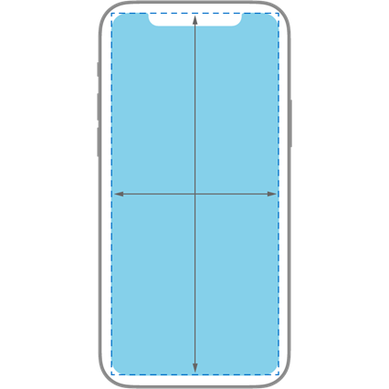
We need to consider the screen layout when designing the app. Apps can have different layouts, but there are many common screens which will usually have a layout something like the following:

mobile app layout

Images and Gradients

Wherever possible, instead of using images or image gradients, use colours and colour gradients to create in the same effect. Doing so will reduce the usage of complex images and therefore reduce the operational complexity of the app, thus improving performance of the app.

Building an App User Interface

Planning is very important before we write any code in order to convert an app design, into an actual functioning app.  The following activities are involved in building the design for a native mobile app.

Cutting up images

iOS

A standard-resolution display has a 1:1 pixel density (or @1x), where one pixel is equal to one point. High-resolution displays have a higher pixel density, offering a scale factor of 2.0 or 3.0 (referred to as @2x and @3x). As a result, high-resolution displays demand images with more pixels.

For example, suppose you have a standard resolution (@1x) image that’s 100px × 100px. The @2x version of this image would be 200px × 200px, and the @3x version would be 300px × 300px.

Android

To provide good graphical qualities on devices with different pixel densities, we need to include multiple versions of each image in your app—one for each density bucket, at a corresponding resolution. Otherwise, Android will scale your image so it occupies the same visible space on each screen, potentially resulting in scaling artifacts such as blurring.

For example, if you have a image that’s 48×48 pixels for medium-density screens, the following size images need to be included within the app:
• 36×36 (0.75x) for low-density (ldpi)
• 48×48 (1.0x baseline) for medium-density (mdpi)
• 72×72 (1.5x) for high-density (hdpi)
• 96×96 (2.0x) for extra-high-density (xhdpi)
• 144×144 (3.0x) for extra-extra-high-density (xxhdpi)
• 192×192 (4.0x) for extra-extra-extra-high-density (xxxhdpi)

app development

Using default icons

iOS and Android provide access to a small number of system icons. These built-in icons are available for common tasks and types of content. Every system-provided image has a specific, well-known meaning. To avoid confusing users, it’s essential that these system icons are used in accordance with its meaning and recommended usage.

iOS

standard app icons when building a mobile app

Android

Android standard app icons app development

Layout Construction

iOS

Auto Layout is a development tool for constructing adaptive interfaces. Using Auto Layout, we can define rules (known as constraints) that govern the content in an app. For example, we can constrain a button so it’s always horizontally centered and positioned eight points below an image, regardless of the available screen space.

Auto Layout automatically re-adjusts layouts according to the constraints we specify for certain environmental variations, known as traits. We can code an app to dynamically adapt to a wide range of traits.

auto layout use when building a mobile app

Android

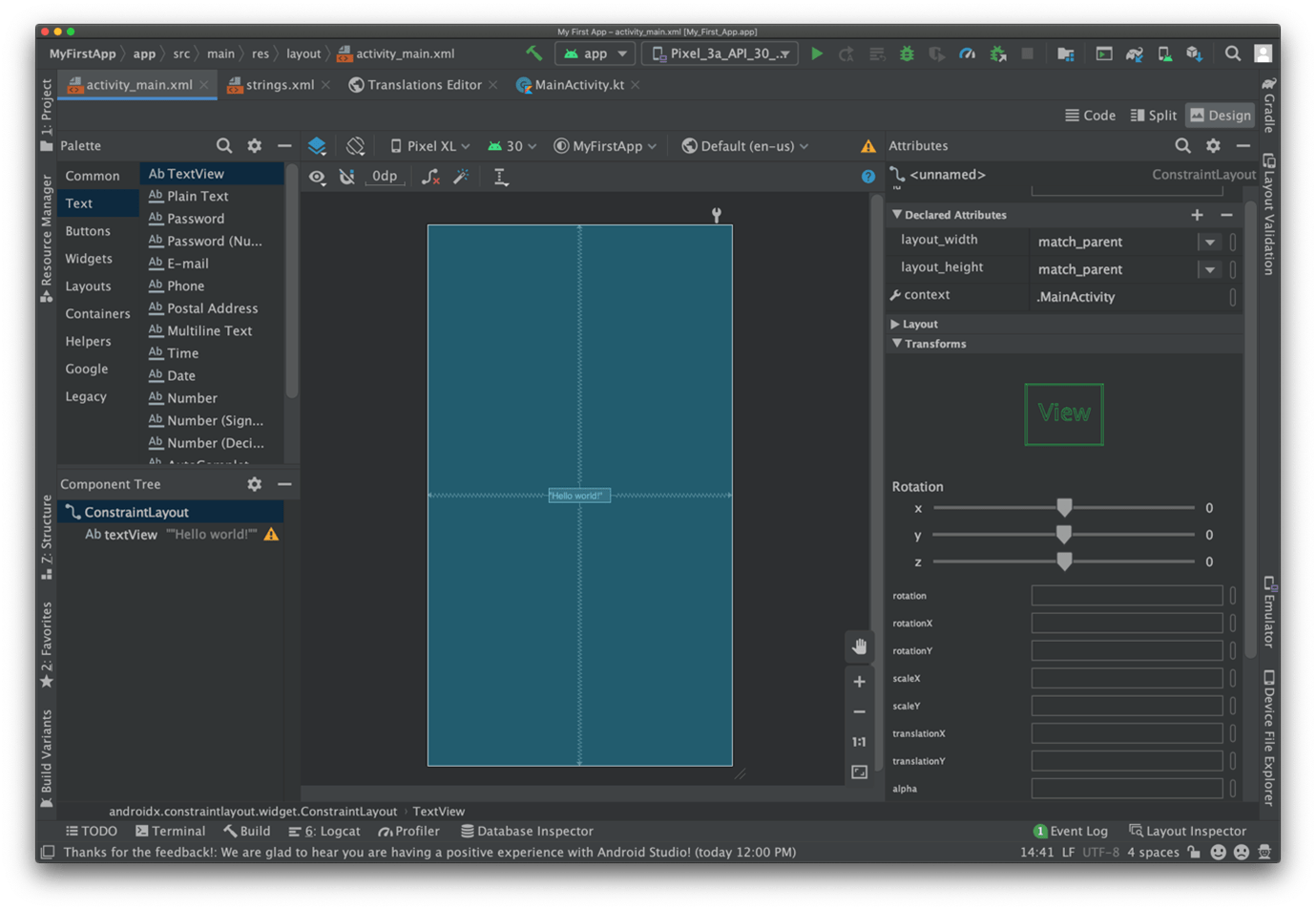
Android provides an XML vocabulary for ViewGroup and View classes, which means that most of the user interface of an Android app is defined in XML files. The Android Studio’s Layout Editor is used to assist in the creation of the user interface; it writes the XML as the programmer drags and drops views to build out an app layout.  Fine adjustments can then be made within the XML if required.

building an Android mobile app interface

Code Manipulation of the user interface

iOS

The Interface Builder editor within Xcode makes it relatively simple to design a full user interface without writing any code. Simply drag and drop windows, buttons, text fields, and other objects onto the design canvas creates a functioning user interface.

We can independently design interfaces, separate from their implementations. User interfaces are actually archived Cocoa or Cocoa Touch objects (saved as .nib files), and iOS will dynamically create the connection between UI and code when the app is run.  It also assist developers to re-use common design elements.

Android

The Layout Editor enables us to quickly build layouts by dragging UI elements into a visual design editor instead of writing layout XML by hand. The design editor can preview a layout on different Android devices and versions, and we can dynamically resize the layout to be sure it works well on different screen sizes.

Supporting Libraries

We can develop custom screen designs without using third-party libraries, but certain libraries are very beneficial for efficiently building highly customised designs.

For both iOS and Android there are numerous libraries we can use for custom components like alert, popup, chat and animation.

iOS examples:
• LoadingShimmer
• ViewAnimator
• AnimatedCollectionViewLayout

Android examples:
• GarlandView
• InfiniteCards
• SparkButton

Testing

Once we have completed the build of an app – that’s implementing both the design and the required functionality – then it is imperative that we undertake thorough testing.  As a developer, I will thoroughly test my app, but it is also important that an end user tests it as well, as they are likely to uncover issues that I have considered.

Mobile application testing is very different from software testing and website testing. We need to consider the following before performing mobile application testing:

  • Screen resolution (different screen sizes in both iOS and Android)
  • Screen orientation (landscape, portrait)
  • Different devices’ manufacturers (only for Android phones)
  • Different operating system versions in both iOS and Android can have an impact
  • Changing a system settings like font size, themes and dark mode
  • Turning on/off GPS and incoming calls

This article provides a simple overview of what’s involved in building a design into a functioning mobile app. If you have questions, please don’t hesitate to get in touch.

Facebooktwitterredditpinterestlinkedinmailby feather

Subscribe to our monthly

Contactpoint Email News

Our enews is sent out approximately monthly, and contains information on latest digital technologies, and how these can be used to help your organisation grow.

To subscribe, simply fill in your details below: