
Spot the Odd One Out & User Interface Design
January 30th, 2022 by Heather MaloneyDo you remember playing the game “Spot the Odd One Out” when you were a kid? I used to love that game (yep, there’s a reason I ended up working in information technology) and it turns out that this is an important skill when working on user interface design for software and mobile apps.
As websites and web applications grow over time to fit in new information / functionality, our clients can be tempted to say something along the lines of “just add new function / information x into the menu / screen y”. The fact that they needed to say “just” is a strong indicator that it doesn’t actually fit there … they are introducing “the odd one out”. It’s at this point that the rot is setting in! What started out as a well thought through information architecture has just been muddied. One quick decision, or many little decisions like this over time, will lead to a confusing user experience.
But how to explain the Macca’s kiosk app, and the location of the Decaf option?
One of the outcomes of the pandemic has been the expanded installation of kiosk machines at the front door of MacDonalds, which patrons are encouraged to use to place their order rather than walking up to the counter and telling the assistant what they want. [I hope they disinfect the screens regularly.]
Have you ever tried to order a decaf? [Okay, I know that particularly if you are in Melbourne you are saying in your head “What??!! – decaf? Of course not!” but go with me on this, some people do actually drink decaf even in Melbourne. In my case, caffeine just interrupts my sleep. Sometimes I like a hot milky drink, and don’t want to load up with sugar (i.e. hot chocolate) so a decaf is great.
These are the steps to order a decaf via the Maccas kiosk machine:
- Press the Start Order button.
- Choose McCafe Drinks.
- From the McCafe Drinks menu, choose from:
- Cappucccino McCafe
- Latte McCafe
- Flat White McCafe
- Long Black McCafe
- Mocha McCafe
- Hot Chocolate McCafe
- Espresso McCafe
- Macchiato McCafe
- Piccolo Latte
- McCafe Deluxe Iced Coffee
- Iced Chai Latte McCafe
- Iced Mocha McCafe … (there are more options)
I want a Decaf Flat White, so I choose #3.
- Choose your type of milk.
- Click Customise (on the assumption that you actually noticed that button, and didn’t end up on the order summary screen before it was too late).
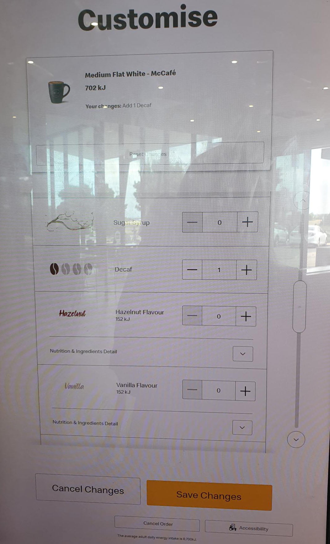
- The top of the customise screen allows you to choose how many espresso shots are in your coffee. Then underneath that is a list of additional ingredients. This list starts with sugar packet, chocolate powder and Splenda. You have to scroll down past the bottom of the screen to finally arrive at Decaf. Press the up arrow for the number of shots to choose Decaf.
- Press the Save Changes button at the bottom of the screen.
- You are then presented with the “May we suggest…” set of options i.e. would you like fries with your order. Press ‘Not Today’.
- You are then presented with Your Order. Press Complete Order. (There are sub options on this page for donating to a charity).
- You are then presented with the payment options screen, in which you have to choose either you want to pay by card or pay at the counter. Press the large ‘Contactless’ button.
- Via the PIN pad next to the kiosk make your payment.
That is a total of 11 steps. But, if you are like me and you choose Drinks first, before realising that it doesn’t contain the coffees, and you miss seeing the ‘Customise’ option and have to find that from the order summary screen, you can add another 3 – 5 steps to the above. Feeling charitable, add a couple more steps again.
It took me about 5 trips to Maccas to figure out that you could order a decaf via the kiosks. In prior trips, I either went without, or bailed half way through my order and went up to the counter and ordered in person even though they wanted you to use the machine instead. Once, a staff member tried to show me how to order a decaf via the kiosk, but gave up in favour of going back behind the counter and placing my order from there.
Perhaps the reason it took me so long to figure out is because, to me, Decaf is a different drink, it’s not a customisation of a coffee, just like Peppermint Tea is a different drink, and not a customisation of black tea. If I wanted to order a decaf, why would I ever think “oh, I’ll start by choosing a caffeinated coffee?” The McCafe Drinks menu includes hot chocolate, so why not Decaf? Now that I have turned my mind to the question, I think I know the answer; it’s because it is conceivable that I might want a decaf latte, or a decaf long black etc. Maccas probably don’t sell enough decafs to worry about including a decaf version of all the different types in the main set of options, so they added it to the list of customisations instead. So my frustration is caused by inappropriate categorisation of items, and an obscure customisation process.
I’m very computer savvy, but it takes me (even without getting a decaf) about 3 times longer to place an order through the machine than it does to place an order via the person behind the counter. This is in part the result of the kiosk user interface being filled with upsells and question after question. At the counter, I can place my order with one statement (“May I please have a standard, flat white, decaf, with regular milk”) answer one question about taking away, and then tap your card. Done.
Maybe the kiosk should allow you to speak your order to the machine? I wonder what the Macca’s store statistics are telling them about the success of their new kiosks as the primary customer interface?
The above anecdote shows why careful thought needs to be given to user interface design. Your website’s navigation menu is a user interface, just as much as the screens of a mobile app or kiosk software. The general public will probably put up with a less-than-ideal user interface in a Macca’s store, because they are already there and know what they are going to get, even if they are frustrated when placing their order. But a person using your website / app might not be quite so patient with your organisation.
Good user interface design will ensure that all the most commonly used tasks are intuitive for the user to accomplish, and involve the minimum number of steps. Buying a decaf was probably, rightly, low on the priorities of the Maccas kiosk software designers. What do you think of the kiosks, or are you skipping them in favour of drive through (voice ordering), or another vendor altogether?
What’s the most frustrating user interface you have to use?


